I'm sure every Etsy shop owner will have heard of the shop home redesign that Etsy is rolling out this month. The purpose of this is to give shop owners more creative control including branding. In addition everything will be on one page. Currently we have until April 5th to edit our shops before the new look will go live for all buyers to see. While I'm all for change if it helps me get more exposure, the timing is a bit unfortunate as the first quarter is typically my busiest of the year. Nevertheless, I made some preliminary changes. Here's an overview.
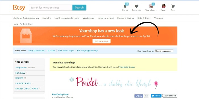
This is how my shop home page looks right now. Clicking the edit button at the top will lead you to the new shop from where you can fine-tune the new look.
There are now three banner options available.
- small banner 760 px x 100 px
- cover photo minimum 1200 px x 300 px
- none
I tried all three, but finally went with a large cover photo that shows some of my bestselling work. I made it a little taller to accomodate my larger pieces. The small banner is what I had originally, but it won't be visible on mobile devices and choosing none leaves too much white space for my taste.
Also, since I've received a lot of compliments on the new look of my blog, I'm considering having a custom logo to replace the current shop icon (the two hearts). In my opinion the shop owner picture could be a little larger. It looks kind of lost...
Featured listings are right below the header. They are a bit larger, and same as before you may choose up to four images. I didn't previously have any items featured, because the overall look was much more compact, but in the new shop I wanted to fill that gap between the header and the listings. Also, the about and policies sections that were previously on the left sidebar are now above the featured listings. These are a bit difficult to spot at first. The shop announcement has moved to underneath the featured listings.
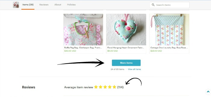
And finally...the actual listings. While editing my new shop I realized that buyers will need to do a lot of scrolling up and down. Not sure how they will feel about it. I know that some don't like scrolling prefering to click through the pages instead. But in the new shop there are no pages! Instead there is a button to click at the bottom of the home page to show more items, much like Google images. Reviews are now visible right beneath the listings. Now more than ever it's crucial that the latest review that most buyers will read when scrolling down that page has a high rating.
Have you finished editing your new shop look yet? Which banner type do you prefer and do you feel these changes will have a positive impact on your sales? Do share in the comments!


Hallo liebe Duni,
ReplyDeleteso ganz habe ich noch nicht verstanden, was es mit dem neuen Design auf sich hat.
Ich habe jetzt auch einen Banner drin und ein kleines Vorschaubild für den Shop. Ich mag es gar nicht, schon wieder alles neu machen zu müssen. Es stresst mich zur Zeit.
Dein neues Design gefällt mir gut: klar, übersichtlich, ansprechend.
Viele liebe Grüße, Synnöve
Liebe Synnöve,
ReplyDeleteich weiß auch nicht warum immer alles verändert werden muss! Ob das neue Design mehr Kunden bzw. Umsatz bringt ist abzuwarten...
I've always found redesigning things to be frustrating. Looks like you're doing good with it though
ReplyDeleteI haven't read any single thing about it although I found "edit new shop" all the time. Thanks for this reminder. I have to pay more attention to my branding. Yours look really professional, Duni! I cannot wait to see your shop new look on April 5!
ReplyDeleteThanks Dita :)
DeleteI really need to take a look at my shops. I have only glanced at the new layout. You are right, the shop owner photo is way too small in proportion to the rest of the page. I hope the browsing is still easy. As a visual person, I prefer to see more listings (smaller photos) on a page. We shall see how changes work out! It always takes some time to get used to something different.
ReplyDeleteI still need to create a new, larger banner (I just have my old, smaller one uploaded now). I think it's a little busy looking with everything on one page, but after some initial frustration I decided there was no use stressing over it. Etsy clearly thinks the changes will be positive or they wouldn't be making them and me being stressed isn't going to change the roll out.
ReplyDeleteOh, I will have to go check it out to see the changes. You always create a very calm, inviting look to your site--I'm sure that will transfer to Etsy as well.
ReplyDeleteI like the new cover you chose to do. I've been reading about the changes but still haven't decided if I'm opening my shop again or not.
ReplyDeleteI did a quick redesign on my shop but will have to wait to fine tune it until Robbie is home from the road to help with the kids. It will be interesting to see how the change goes. I agree about the scrolling issue. Your shop looks great!
ReplyDeleteI saw the header when I logged in, but I haven't had a chance to work on any of it yet because I have local clients who need my brainpower. Haha. But it's on my list! Your new shop looks great!
ReplyDeleteYour new look is lovely! I have zero time to mess with this so I doubt I'll get to it until the end of April. :(
ReplyDeleteYour new look is wonderful! I tried doing a few changes too, my old banner will not work now with the new look but I am glad that it is bigger now, I was also thinking of adding some item pics along with my tagline! Still in process!
ReplyDeleteThe only change I made so far was for my banner. I chose the smaller banner so the first 4 items would show at first glance. But since you have items in your banner/cover photo, that works really well.
ReplyDeleteI also changed my announcement a little since less of it shows now than before.
And I made sure to keep my own policies. I am not a fan of their boilerplate policies, even if it will help you in search (as they claim). I'll stick to my own policies, thank you!